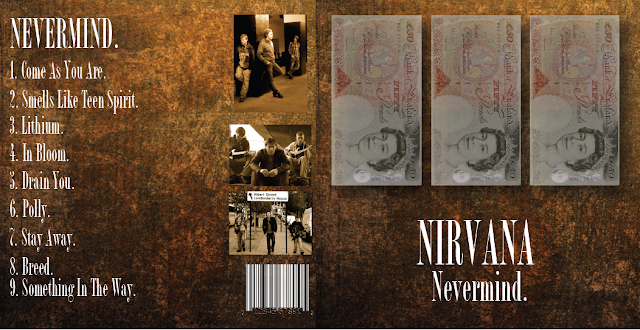
This is my final completed album cover for Nirvanas, Nevermind Album. As you can see I followed by earlier plan and included all the key elements I thought were important in creating a complete Digipak cover that would attract an audience.
When it came to the text, based on earlier research, I managed to find the same text that Nirvana albums actually used to use, I felt this gave the album a more authentic feel so I used that in white to contrast from the background and to grab the audiences attention. Of course I varied the size throughout as the album title required more attention and is more eye catching than the tracklist.
With regards to artwork on the front, I was inspired by the original Nevermind album where the child is reaching for money. I included 3, £50 notes on the front album cover, this is to represent every member of the band as being a piece of money, relating to my music video that most of the world is based on attractive human capital and everyone aspiring for economic greatness is what society expects from us. I faded the images and gave them shadows as it relates to the idea that we cannot "see the people behind the money", the money comes to the front and grabs our attention and thats whats seen as important.
I included a tracklist on the back of the cover to let the audience know what tracks are included in the digipak, this track listing has the same content as the original album, just in a different order so they weren't exactly a-like as this is my interpretation of it.
I also included photos of the band on the back of the cover as the front cover didn't contain any band photos I felt that having some would allow the audience to recognise that the people on the album are in my music video and vice versa. The first image is from a photoshoot I did with the band, the other two are actual screengrabs from my final music video. I changed the images tones, saturation and brightness to give them a damaged, "sepia" effect and make them darker to fit in with the overall look of the album cover better.
I also included a barcode to make the digipakcover seem more realistic, as if it was actually for sale as most CDs require this to be on the outside cover.
Overall, I decided to keep the cover simple, with some artwork relating to my music videos message so they all link with one another. I kept it simple as rock covers are rarely ever extravagent and Nirvanas were a clear example, I felt that the music should be the main emphasis, as thats what the audience buys the CD for.
No comments:
Post a Comment